A New Look for a Trusted Legacy: Introducing the New LemonAID Fund Logo
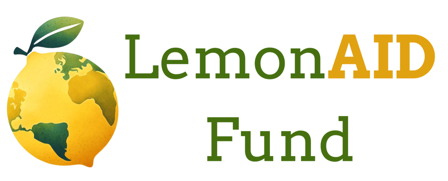
The new LemonAID logo!
A New Chapter: The Evolving Identity of LemonAID Fund
As we celebrate 25 years of LemonAID Fund, we honor not only the people and stories that have shaped our path but also the visual identity that has quietly accompanied us through it all. For a quarter century, a single, hand-painted lemon has symbolized our commitment to making aid personal, reminding us, with every brushstroke, that healing and dignity begin with human connection.
Now, we turn a page. Our new logo pays homage to this legacy while embracing the global reach and growing impact of our mission today.
At the heart of the new logo is a modern lemon—bright, organic, and textured like its hand-drawn predecessors. But this lemon carries something more: a map of the world across its surface, boldly affirming that our work is international, our partnerships diverse, and our commitment universal. The Earth-shaped lemon underscores what we’ve always believed, that healing is global, and that aid must travel across boundaries of geography, culture, and circumstance.
In keeping with our name, AID now appears in bold, capitalized letters—and a warm golden hue. This isn’t just a design choice. It’s a declaration. AID is at the center of who we are. It’s what we offer. It’s what we amplify. And it stands for more than assistance; it represents Agency, Integrity, and Dignity, the very pillars of our Forgiveness, Gratitude, and Appreciation (FGA) program, which offers concrete tools for healing individuals and communities around the world.
You’ll also notice something else: the color of AID will shift depending on the theme or campaign. Why? Because color has power. It evokes emotion. It can symbolize urgency, peace, joy, or transformation. Just as no two human stories are alike, our expression of AID adapts to the context in which it’s needed, whether we’re addressing trauma in post-conflict Sierra Leone, supporting educational equity in the U.S., or planting seeds of peace and forgiveness through our FGA initiatives.
The new logo bridges what was and what’s becoming. It reflects our evolution from a handmade symbol carried by brushstroke and envelope, to a living identity that can move fluidly across platforms, languages, and culture, while staying rooted in our founding ethos: Do better. Do it together. And do it with heart.
Stay tuned for more stories as we continue this anniversary celebration. And remember, where there’s a lemon, there’s always the potential for LemonAID.